Why Is Everyone Green or Purple?
When I started building Relay, a native macOS Matrix client, I wanted a way to assign a unique color to each user. The idea was simple: hash the user's ID, derive a hue, and use it for their avatar background and message bubble. The same person always gets the same color, across app restarts, for all installations of Relay. This created a fun "what's your Relay color" meme among the early adopters. You can even see your own "Relay color" in your own outgoing messages (mine's purple, btw).
The algorithm was just twelve lines of Swift:
static func color(for name: String) -> Color {
    let hash = djb2Hash(name)
    let hue = CGFloat(hash % 360) / 360.0

    let nsColor = NSColor(name: nil) { appearance in
        if appearance.bestMatch(from: [.darkAqua, .aqua]) == .darkAqua {
            NSColor(hue: hue, saturation: 0.5, brightness: 0.65, alpha: 1)
        } else {
            NSColor(hue: hue, saturation: 0.45, brightness: 0.75, alpha: 1)
        }
    }
    return Color(nsColor: nsColor)
}
Start by hashing the username (or any string, really) with a DJB2 hash, modulo 360, divide by 360 to get a hue fraction, plug it into HSB with fixed saturation and brightness. Clean, fast, deterministic. It worked! It's what is shipping in Relay today.
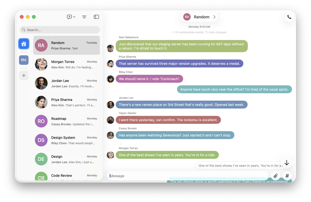
That was over two months ago, but as I kept using Relay and developing it, I started to notice something. It felt like nearly everyone was either green or purple.
The nagging feeling
Now, it wasn't literally two colors. But scrolling through messages, the bubbles seemed to cluster into about two or three groups. Given the huge variety of Matrix IDs, why are so many colors nearly identical.
My first thought was to question the hash function. If the function was not creating an even distribution of hash values, that should be apparent with some quick statistics. I hashed 100,000 synthetic Matrix user IDs (@user0:matrix.org through @user99999:matrix.org) and bucketing the results by hash % 360 (the first step in the color() algorithm above). If the hash is unbiased, then distributing the results across 10-degree bands of the 360º hue wheel means we should see about 2,778 (100,000 / 36) hashes per band. It turns out, every 10-degree band of the hue wheel received between 2,664 and 2,902 names -- within ~5% of the expected 2,778.
So the hash itself wasn't the problem. DJB2 modulo 360 distributes remarkably uniformly across the 360 integer hue values. Something else was wrong.
Measuring the problem
So I started to wonder about color itself. Were all the purples really the same purple? To test this, I split the hue range into 7 discrete "colors" myself, picking places where I feel like the color really shifted from one to another. I ended up with: red, purple, blue, cyan, green, yellow and orange. I bucketed 35 sample Matrix user IDs into these categories:
| Category | Hue range | Count | % of samples |
|---|---|---|---|
| Green | 70–149 | 10 | 29% |
| Purple | 260–329 | 11 | 31% |
| Cyan | 150–194 | 4 | 11% |
| Yellow | 45–69 | 3 | 9% |
| Blue | 195–259 | 3 | 9% |
| Red | 0–14, 330–359 | 2 | 6% |
| Orange | 15–44 | 2 | 6% |
Sixty percent of all names landed in Green or Purple. And within those groups, the collisions were literal: @frank:matrix.org and @grace:matrix.org both hashed to hue 188. @charlie:matrix.org and @oscar:matrix.org both hit 130. @quinn:matrix.org and @ruth:matrix.org -- both 285.
This wasn't a hash problem. So this was a color space problem?
The HSB hue wheel is a lie
Okay, not a lie. But it's not what most people think it is. (I leveraged AI here to help me distill the color space domain into something that can fit in a blog post.)
HSB (Hue, Saturation, Brightness) is a convenient mathematical transformation of RGB. Its hue axis is a 360-degree wheel, and it's tempting to assume that equal angular steps on that wheel produce equal perceived color differences. They don't.
HSB hue is a mathematical transformation of RGB, not a perceptual measurement. You can see this by looking at the hue sweep: the green region spans a huge visual range where neighboring degrees are nearly indistinguishable, while the red-orange region changes rapidly. This non-uniformity is well-known in color science -- it's the reason perceptually uniform color spaces like CIELAB and OKLab exist in the first place. (But I get ahead of myself...)
This means that in HSB:
- Green spans ~80 degrees of the hue wheel (70–150). That's 22% of all hue values, and they all look like some kind of green.
- Purple spans ~70 degrees (260–330). Another 19%.
- Orange gets only 30 degrees (15–45). Just 8%.
When you uniformly distribute hash values across this wheel, 41% of your users will land in "green or purple," even though the hash is perfectly fair. The color space, it turns out, is unfair.
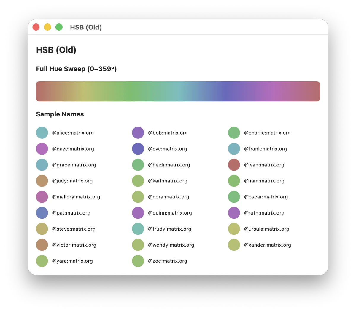
Look at the hue sweep bar above. Notice how quickly yellow transitions to green, how much of the middle is nearly visually-identical green, and how the cyan-to-blue transition is nearly as abrupt as yellow-to-green. The reds and oranges are vivid and varied, but they occupy a tiny fraction of the bar. When you add low saturation (0.45) to make the colors suitable for backgrounds, the perceived gamut compresses even further. Everything turns into a washed-out version of one of six or seven named colors.
Down the rabbit hole: OKLab and OKLCH
Once I understood the problem was perceptual non-uniformity, the question became: is there a color space where equal steps do produce equal perceived differences?
It turns out this is one of the oldest problems in color science. The CIE tried to solve it in 1976 with CIELAB, which improved on raw RGB but still had significant non-uniformity, especially in the blue region. For decades, color scientists refined successive models. Then, in 2020, Björn Ottosson published OKLab -- a perceptually uniform color space that's both accurate and computationally simple. Ottosson's blog post explains it, but I will try to summarize it here. I'll be the first to admit, I am not a color space scientist and I don't deeply understand the math here.
OKLab has three axes:
- L (Lightness): 0 = black, 1 = white
- a: how green-red the color is
- b: how blue-yellow the color is
OKLCH uses fancy math and maps OKLab's axes into something more intuitive:
- L (Lightness): same as OKLab
- C (Chroma): distance from the gray axis -- almost essentially saturation
- H (Hue): angle around the color wheel, in degrees
The crucial difference here is that equal angular steps in OKLCH hue produce equal perceived color differences. A 10-degree shift looks the same whether you're in the reds, the greens, or the purples. This is exactly what HSB fails to deliver.
The conversion math
There's no native Color(oklch:) initializer in SwiftUI or AppKit, but the math is compact, and Ottosson's blog post has a sample implementation in C++. The conversion chain is:
OKLCH (L, C, H)
  -> OKLab (L, a, b)       // polar to Cartesian
  -> Linear sRGB (r, g, b) // two 3x3 matrix multiplies via LMS
  -> sRGB (r, g, b)        // gamma transfer function
In Swift, the whole thing fits in about 20 lines of pure arithmetic:
static func oklchToSRGB(L: Double, C: Double, H: Double) -> (CGFloat, CGFloat, CGFloat) {
    // OKLCH -> OKLab (polar to Cartesian).
    let hRad = H * .pi / 180.0
    let a = C * cos(hRad)
    let b = C * sin(hRad)

    // OKLab -> linear sRGB via LMS intermediary.
    // Matrices from Bjorn Ottosson: https://bottosson.github.io/posts/oklab/
    let l_ = L + 0.3963377774 * a + 0.2158037573 * b
    let m_ = L - 0.1055613458 * a - 0.0638541728 * b
    let s_ = L - 0.0894841775 * a - 1.2914855480 * b

    let l = l_ * l_ * l_
    let m = m_ * m_ * m_
    let s = s_ * s_ * s_

    let lr = +4.0767416621 * l - 3.3077115913 * m + 0.2309699292 * s
    let lg = -1.2684380046 * l + 2.6097574011 * m - 0.3413193965 * s
    let lb = -0.0041960863 * l - 0.7034186147 * m + 1.7076147010 * s

    // Linear sRGB -> sRGB (gamma).
    return (
        CGFloat(linearToSRGB(lr)),
        CGFloat(linearToSRGB(lg)),
        CGFloat(linearToSRGB(lb))
    )
}

private static func linearToSRGB(_ x: Double) -> Double {
    let clamped = min(1, max(0, x))
    if clamped <= 0.0031308 {
        return 12.92 * clamped
    }
    return 1.055 * pow(clamped, 1.0 / 2.4) - 0.055
}
There is a Swift package that brings a lot of color standards to the language, but I didn't want to pull in a dependency for a single use case.
Choosing the right Lightness and Chroma
OKLCH separates the three perceptual dimensions, which makes tuning straightforward:
- Hue comes from the hash, same as before.
hash % 360now means something perceptually fair. - Lightness controls how light or dark the colors are. For dark mode backgrounds with white text, I settled on L = 0.55. For light mode, L = 0.72.
- Chroma controls vividness. Too high and some hues apparently clip out of the sRGB gamut. Too low and everything looks gray. I found C = 0.12 (dark) and C = 0.11 (light) to be a sweet spot; vivid enough to clearly be /a color/ but not too bright, and low enough to always stay in the color gamut.
One subtlety: not every OKLCH triplet maps to a valid sRGB color. At high chroma, some hues exceed what a standard display can show. But at these conservative chroma values, essentially all 360 hues are safely in-gamut. The linearToSRGB function clamps to [0, 1] as a safety net, but in practice it should never activate.
The result
The updated color(for:) function has the same signature. The DJB2 hash stays. The hash % 360 stays. Only the color space changed:
static func color(for name: String) -> Color {
    let hash = djb2Hash(name)
    let hueDegrees = Double(hash % 360)

    let nsColor = NSColor(name: nil) { appearance in
        if appearance.bestMatch(from: [.darkAqua, .aqua]) == .darkAqua {
            let (r, g, b) = oklchToSRGB(L: 0.55, C: 0.12, H: hueDegrees)
            return NSColor(srgbRed: r, green: g, blue: b, alpha: 1)
        } else {
            let (r, g, b) = oklchToSRGB(L: 0.72, C: 0.11, H: hueDegrees)
            return NSColor(srgbRed: r, green: g, blue: b, alpha: 1)
        }
    }
    return Color(nsColor: nsColor)
}
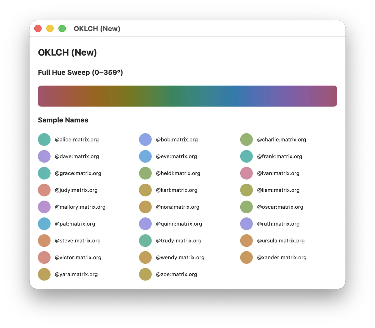
Compare the hue sweep bars. Where HSB had a large band of green and an abrupt cyan-blue cliff, OKLCH transitions smoothly and evenly across the full spectrum. Every degree of hue is visually distinct from its neighbors at a consistent rate.
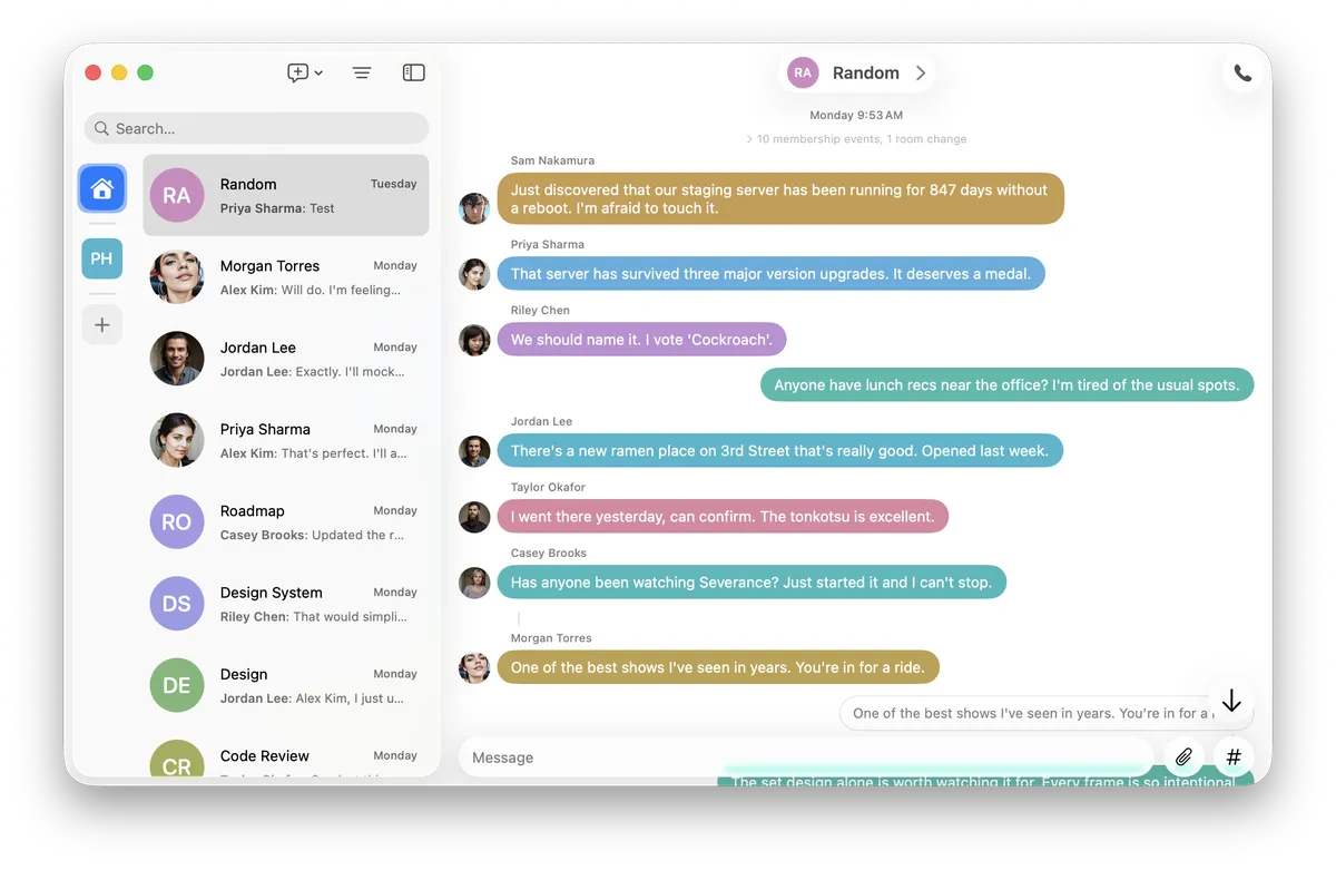
In the app itself, the difference is immediate. While I don't think it's obvious enough from these screenshots given the small number of room members represented, the difference is noticeable. The overall palette feels more vibrant and friendly.
What I learned
The bug was in my assumptions, not my code. The hash was fair. The modulo was correct. The saturation and brightness were reasonable. Everything was "working." But I was treating HSB hue as if it were perceptually linear, and it isn't. The algorithm was uniformly distributing values across a non-uniform space.
Color spaces encode design decisions. HSB was designed to be a convenient transformation of RGB for UI color pickers, not for perceptual uniformity. Using it for perceptual tasks -- like "make these colors look different from each other" -- is a category error. OKLCH was designed specifically for perceptual uniformity, and it delivers.
Conclusion
Every user's color changed. This is the tradeoff: switching color spaces is a breaking cosmetic change. Every avatar shifts. But the old colors were broken in a way that mattered -- users in the same room looked the same. The new colors are correct in a way that the old ones couldn't be, no matter how much you tweaked the saturation slider.
This was a fascinating learning experience. While I think I had an assumption that color spaces were a complicated science, I had no idea how deep the field really goes. I barely scratched the surface, and had many of my assumptions challenged completely. It's an absolutely thrilling experience to learn that past assumptions are categorically wrong.